ART + DESIGN VISUAL IDENTITY
This is a project from University of Alberta DES 494.
The client is the Art and Design department, who asked for
a new identity that will be applied through a visual system in the future years of the program. The logo, logotype and tagline were designed based on the central values of the department: innovation, leadership, and forward thinking.
The logo is constructed from the letters in the 3 areas of learning: fine arts, design studies, and history of art, design and visual culture. The overlapping arrow represents the interdisciplinary studies at the University of Alberta, and the leadership in the art and design department.
Logo, logotype, and tagline

Logo safe space
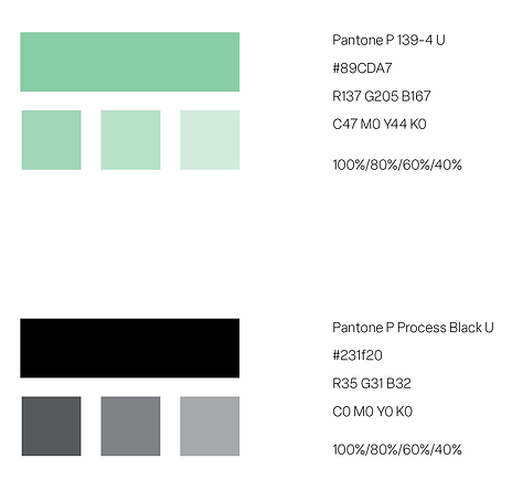
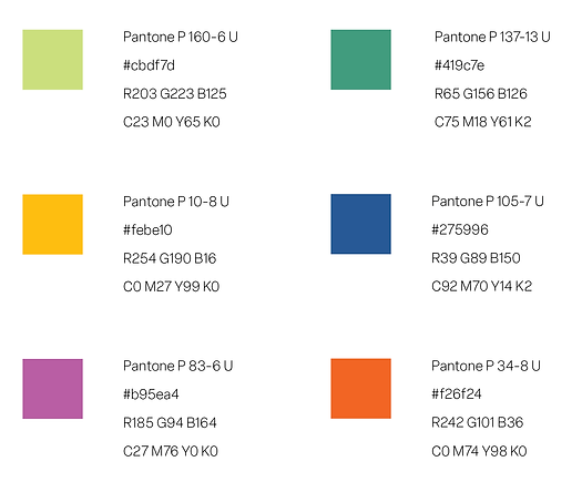
The colour palette for Art & Design is a refreshed and updated look to the University’s identity colours. The brightened green and mixes with a vibrant yellow is a representation of the youth and innovation in the program.
These colours are further exemplified and expressed through the application.
Primary Colours
Secondary Colours
The typefaces are chosen for their clean and modern nature. 2 different typefaces were used, with Elza being the main typeface for most text.
Typography

Ideation process

Logo construction process
For the ideation process, I utilized the logo matrix. The matrixes was derived from word association that extended from the client's values.
Initially, the logo was too sharp and technological. The final logo was modified to look friendlier to attract the targeted audience of young students.
To see how this identity was explored and brought to life, see the application.


